Where should the search function be placed?
By Per Ström and Richard Whitehand, May 2006
Several years ago in the USA a study was carried out to investigate where users expected to find different common elements on web pages. The study, carried out by the Software Usability Research Laboratory at Wichita State University was documented in an article by Michael Bernard.
Inspired by this interesting piece of research, we decided to conduct a similar study in Sweden to gather data concerning where Swedish Internet users expect to find different elements on web sites today. The aim of the study was to gather objective data to help support our interaction design work in certain client projects, however in this article we share some of the findings.
140 internet users from the Stockholm area participated in the study. Ages ranged from 16 to 66 years old and the background of participants was quite varied, though all used the internet at least a few times a week. They were asked where they expected to find the following:
- Main navigation menu
- Search function
- Shopping trolley
- Telephone number to the company
- Adverts
- Home link
- Login function
- Logout button
To support the study a special web-based form was created, allowing users to simply ‘click in’ areas of a web page where they expected to find different elements (users could re-use the same areas for different items if they wished).
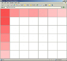
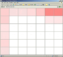
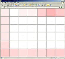
The results were interesting in that there were differences compared to the findings from the earlier American study. Illustrated below are the findings for the first three elements (the darker the shading of an area, the more participants that selected it). .
Main navigation menu
Search function
Shopping trolley
When designing the layout of a web site it is important to consider where users expect to find things. Over the years we’ve studied user interaction with hundreds of web sites and seen how the unusual placement of elements can cause trouble for users. In some cases inappropriately placement can actually prevent people from using a site.
We plan to repeat this study once a year to follow how user expectations vary over time.
Related articles:
- Examining User Expectations for the Location of Common E-Commerce Web Objects (Software Usability Research Laboratory, Wichita State University, 2002)
- Where's the Search? Re-examining User Expectations of Web Objects (Software Usability Research Laboratory, Wichita State University, 2006)
Did you find this editorial interesting?
You might like to read some of our other editorials.
Please send us an email if you have any comments or suggestions!