New Year usability resolutions for 2002
By Richard Whitehand, January 2002
2001 was by all accounts an interesting year for usability, from which there are no doubt many lessons to be learnt, especially when it comes to web site usability.
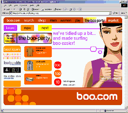
After its bankrupcy in 2000, Boo.com bounced back with a simplified web site in 2001. They announced that they had "tidied up a bit and made surfing boo easier", after all the criticism previous versions of the site had received.
Unfortunately other web sites still hadn't got the message - as a usability article on cnet.com in March demonstrated, quoting Jared Spool's studies of e-commerce web sites in the USA, where users were successful only 42% of the time. That was on the best-designed sites!
In September the European Commission adopted a communication on improving the accessibility of public web sites. The creation of many of the barriers to web accessibility for disabled and elderly internet users can be avoided through following techniques set out in the W3C/WAI guidelines, and it is these guidelines that the Commission are promoting.
In a press release on the 25th of September the Commission said that:
... "The Member States and the European institutions are taking on board the guidelines for all public web sites by the end of 2001, and have agreed to exchange information and benchmark their progress. Progress on web accessibility and best practice in the Member States is monitored by an eAccessibility for all expert group, set up under the eEurope Action Plan 2002."
This will undoubtedly put pressure on public sector web sites and hopefully commercial sites as well. If successful then this is clearly a major step in the right direction for improving Internet accessibility for disabled and elderly user groups.
So, on to the New Year usability resolutions, of which there are three. Manage all three and your user interface design will come a long way!
1: Know what your users need
One of the most common problems with user interface design, especially for web sites, is that too much interface design effort gets spent on implementing functions and features that are not of primary interest to the user. Ensure you understand your users and their basic requirements. Focus on the main things that users are going to use your interface to do, and if you not crystal clear about what they are, find out!
2: Keep it simple, focus on use
Once you've established the key functions and features then the next challenge is to implement them simply and effectively. Leave the "wouldn't it look good if we..."-type design discussions until later unless they directly concern how successful users are going to be in using the interface. Instead, focus on how users will use the interface to achieve their goals, how they will move through the interface, fill in information, make choices, etc.
3: Test with users
Test your interface designs with users. Test early and repetitively - nobody gets everything right first time. You don't necessarily need to conduct large scale tests, and you don't need to have a fully functioning prototype - its quite possible to test with paper prototypes.
It is important to test with representative users and with realistic usage scenarios. Where possible the person conducting the test should not be a heavy stakeholder in the design. Once you start coding then don't forget to consider accessibility for disabled and elderly users!
Did you find this editorial interesting?
You might like to read some of our other editorials.
Please send us an email if you have any comments or suggestions!