Where should the shopping trolley be placed?
Av Per Ström, March 2009
In the spring of 2006 we conducted a study "Where should the search function be placed?" to collect data about Swedish Internet users’ expectations of where key elements in a web site should be placed. This was inspired by a study conducted by Michael Bernard at the Software Usability Research Laboratory at Wichita State University.
Now, in the Spring of 2009, we have conducted a follow-up study. As before, the goal was to collect objective data to support our interaction design work in client projects. 327 internet users with varying characteristics (age, sex, occupation) participated in the study, all of whom used the internet for at least a few hours a week.
As before, a special web-based form was used, allowing users to simply ‘click in’ areas of a web page where they expected to find different elements (users could re-use the same areas for different items if they wished). Participants were asked about where they expected to find the following:
- Main navigation menu
- Search function
- Shopping trolley
- Telephone number to the company
- Adverts
- Home link
- Login function
- Logout button
Compared with the 2006 results we found that expectations regarding the placement of a few objects had changed somewhat, whereas for many there was greater consistency in expected placement.
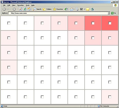
Below are some examples from the results - the darker the shading of an area, the more participants that selected it.
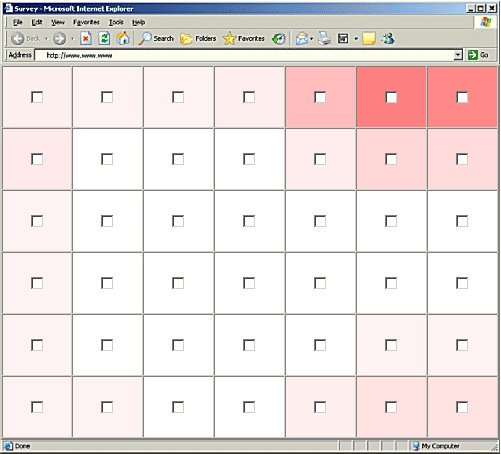
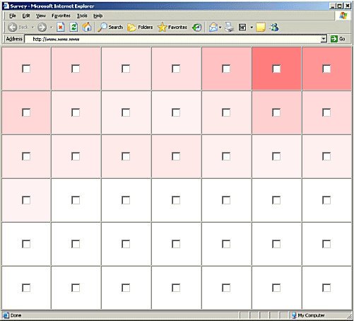
Shopping trolley
In 2006 there were two areas of the page where the shopping trolley was expected to be – to the top right, and along the bottom. There has been a clear change towards the top right being the favoured spot.

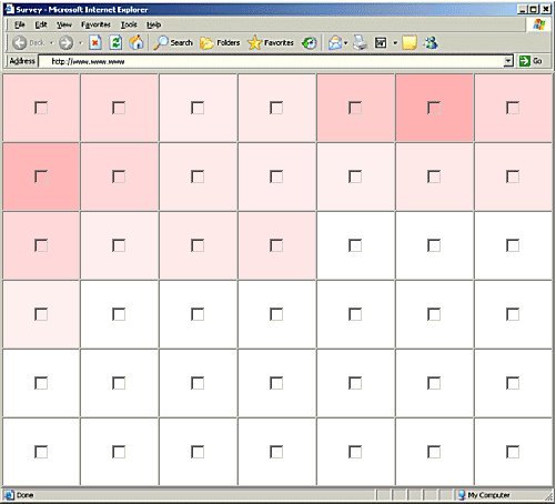
Login
In 2006 the expectations around the placement of the login function were quite varied. This is still the case today, but with expectations tending to be more clearly towards the top right corner of the page.
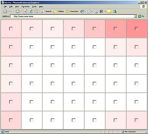
Logout
Even ‘logout’ is more clearly expected to be found in the top right corner.
When designing the layout of a web site it is important to consider where users expect to find things. Over the years we’ve studied user interaction with hundreds of web sites and seen how the unusual placement of elements can cause trouble for users. In some cases inappropriately placement can actually prevent people from using a site.
We plan to repeat this study again in the future, to follow how user expectations vary over time.
Related articles:
- Where should the search function be placed? (previous article 2006)
- Where's the Search? Re-examining User Expectations of Web Objects (Software Usability Research Laboratory, Wichita State University, 2006)
- Examining User Expectations for the Location of Common E-Commerce Web Objects (Software Usability Research Laboratory, Wichita State University, 2002)
Did you find this editorial interesting?
You might like to read some of our other editorials.
Please send us an email if you have any comments or suggestions!